Sunday, 11 December 2011

ImpOssible!

This year at Uni we were put into groups to pre-produce a game! next semester we will be creating a demo of the game using UDK and uScript, but for now the team were to create a trailer and create the concept of the game itself.

Here is the game logo I created for the team and the trailer!


3D Head Model

It's been a while! i'm at my second year at university now and for my 3D modelling assignment I have to model a head and sculpt it in Zbrush! i'm far from finished but here is what i've done so far:

This is the low poly head model I created in 3D Max.


I've imported it into zBrush and began sculpting areas such as the nose, ears, mouth and cheeks.


Tuesday, 29 June 2010

Showcase Review

The digital showcase overall was a great success, potential new students and others came to view our final trailers and work which we created throughout the year, every team managed to complete their trailers in time for the showcase. In one of the rooms there was the trailer production work displayed on a side board, this contained our team storyboards, logo's and concept artwork, the team trailer was projected on the big screen for all to view, many students and others came to view these trailers and were overall impressed with our work, the other room displayed year ones work including storyboards, icons and concept artwork aswell as 3d models. Each of the college students wore their team t-shirts which one of us designed for each team and talked with the potential new students and adults which came to view the showcase, we explained to them what we did throughout the year and what we experienced. Nothing seemed to go wrong during the showcase, all the trailer played without fault so overall it was a success, the most enjoyable part of the day for me was seeing everyones end products and what the year ones students got up to in their work.


Tempus Trailer Review

Team: Lazerbaby
Game Name:
Tempus
Members:
Nat, Ethan, Martin, Jack

Positives:

1/ The models were very well made in this trailer, with great textured enviroments and effects to go with it, I especially enjoyed the part in the forest with the mist effects, this looked really good and had the eight amount of lighting and mist settings.


2/ I particularly enjoyed the soundtrack in this trailer, although it would of been nice to hear more souond effects, the soundtrack went really well with their overall product syncing well with the screen effects they created.

3/ The animation and camera work is really well done in this trailer, the scene which stood out to me more what the model of the shed which then zoomed out as if from a snow globe, this was a very nice touch and added to the fantasy of the game.

Improvements:

Improvements that could be made to this trailer is the lighting, although it is great at times, at other times it is a bit to dark making it hard to see what is going on in the scene, for example when the camera was viewing one of their character models, I only just realaise there was a model their the 3rd time I watched it because it was so dark.

Desolate Trailer Review

Team: Negative One
Game Name: Desolate
Members:

Positives:

1/ This trailer has very good modelling and texturing, the sea looks very good and realistic and I enjoyed the volcano effects created.

2/ The splash screens are well presented and look very professional, they fit in with the overall trailer creating that extra professionalism.

3/ The opening scene is my favourite part of this trailer, it gives the impression that you are in-game choosing the menu and starting the game, this is well modelled and entertaining to watch.


Improvements:

Improvements that could be made to this trailer is the soundtrack being played throughout the trailer, it is very repetative and it would be a good idea to change the music when the scenes change to fit that individual landscape. It also did not have any sound effects, just the one soundtrack, it would be good to have some sort of dialogue . Another improvement that could be made is the overall length of the video and how long it stays in one enviroment, it should be cut much shorter in my opinion.

Zero G Trailer Review

Team: 42
Game Name: Zero G
Members: Dan, Sean, Matthew and Micheal

Positives:

1/ The trailer had very good audio, it had space themed dialogue which fitted well with the trailer because it is set in space, the soundtrack went well with the trailer, it had fast paced music which synced well with the racing scenes.

2/ The modelling was well creating in this trailer, it had realistic spaceships and planets which were rendered and modelled well, the textures are not bad I failed to find any over stretched textures.

3/ The animations was also a good aspect of the trailer I especially enjoyed the wireframe animation. It was very clean with no visible mistakes in animation.

Improvements:

Improvements that could be made to this trailer would be the splash screens, I believe the splash screen take away from the trailers overall professionalism, If they were to improve the splash screens they should make their logo much bigger to "sell themselves" with better animation.

Prodject Summary & Review [Dark Shock]

Dark Shock Trailer:


http://www.youtube.com/watch?v=zPt08UYmyMo&feature=channel

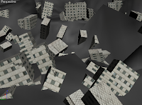
For my scene which is the part where the plane crashes into to city creating a "destroyed enviroment" or destroyed city, I looked at trailers of games which show destroyed city, mainly the Fallout 3 trailer which is based on an apocolyptic wasteland, I looked at fallout 3 trailer for inspiration when creating my enviroment and scene. This fallout 3 trailer fits in with my original plan as it shows an apocolyptic landscape which I originally wanted to create here is what I had created first did not use in my trailer scene:


Does the end product meet your origin
al intentions?

The end product does not meet my original intentions, my original intention for the trailer was going to be themed as a Horror, due the game name "Dark Shock" however my storyboard was not selected to be used in the final trailer creation so the end trailer is different to what I had intended, although it does meet some of the aspects I would have wanted in the trailer, such as the futuristic buildings and destroyed enviroments. The final creation of the product overall was good however I feel I could have done much better with the scene I was chosen to create, due to my lack of 3D Max skill and time spent creating the scene it did not come out as well as I would have liked it to be.

Here are pictures of a character design and destroyed enviroment that I had designed for my original intended product:


Is the end product appropriate for your intended audience?

The end product is appropriate for the intended audience of ages 18+ because the end product shows violence in the game where a ship destroys a city killing everyone inside, we had originally decided to have the game as a 15+ however we later changed our minds so we could create more violent natured game which would require an 18+ age rating. The gender of which the game trailer was aimed at was both female and male, however due to the trailers "spaceships" and "explosions" nature, I think it will be more for the male audience.

Discuss the technical aspects of your work and highlight the strengths / areas to develop
.

For my work I used different programs to create and edit my models/scene, 3D Max being the main one where I creat
ed the model, added textures and animated, Sony Vegas Pro being the other, where I added audio, created transitions between different scenes and it is where I created the splash screens for the final trailer, to create these flash screens I followed some very usful tutorials which taught me how to animate text and other effects. I also used photoshop for the creation of my scene, I needed photoshop to create the textures and Logo design for the game also to create the T-shirt merchandise which was used to create the actual T-shirt but just tweaked a little.

Here is the logo I created for the game trailer:


Here is the T-shirt I designed in photoshop and the printed T-shirt used for the showcase:


The strengths in my work is the landscape I have created, I spent the most time in modelling and texturing the enviroment and with the amount of skill I have in 3D Max (which is not much) I am proud of the outcome, areas in where I can develop though is in the texturing of the other models such as the spaceship and city, I failed to find or create a decent texture and it did not go well with the spaceship I created, the explosion in the trailer could also have been much better, I have no idea how to create an explosion in 3D Max so I had to use a sphere which expanded using animation with an explosion texture on it, not very realistic but it was the best I could do with my knowledge of 3D Max. I think my audio was a little loud in places for example the explosion and music, the music played over the audio effects I added in the video for example you could barely hear the wind or birds chirping, next time I will concentrate more on which audio sounds should be louder than others.

Discuss the content / style of your work

When creating the product one of the main problems I had was trying to texture my spaceship, everytime I added a texture it would stretch and look aweful, after many attempts of trying to solve this I decided to leave it as it was, another problem I had was with the overall size of the enviroment, I created the landscape a bit to big and when it came to merging other models on the landscape they became extreamly small and unfindable, I eventually had to remake the landscape and keep it at a normal size to add my other models. I have learnt from this to keep the plane at a smaller size when planning to create a landscape, if it gets to big it becomes very laggy when textured and it won'y be able to view other models easily. Another major problem I had was when rendering the overall scene, the audio which I added would not work proparly when rendered as an AVI so I ended up rendering in an MP4 file format which solved the audio problem.

I have become a lot more knowledgeable in 3D Studio Max since starting this project, I only knew simple box modelling to begin with but through creating my scene I have become much better at camera uses, lighting effects, rendering, animation and simple texturing. Even though I was behind with my work to begin with I did meet the deadline, although the final scene was not as good as it could have been, I did not manage my time well and if I were to do this project again I would definitely try much harder to complete the work when given.

If you had the opportunity to make this product again would you do anything different? And are you happy with the overall product?

If i were to make this product again I would manage my time much better to get the best out of what I create in 3D Max instead of it being rushly made, I would take the time to take pictures for textures instead of finding random textures on the internet and I would follow more tutorials so I can learn much more about the uses of 3D Max so I can add more effects (such as a better explosion). I am happy with my overall product but I still feel I could do alot better, My peers enjoyed the final overall trailer and complimented on the splash screens that I created in Sony Vegas pro saying it was somewhat of "Movie styled credits".