Signatures


This is a blog to show my college work to provide evidence and to build my portfolio. It will also allow students in my class to give me constructive criticism and feedback.

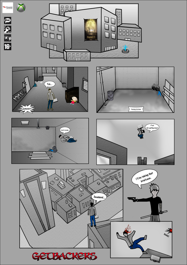
 This is the storyboard I created for my game trailer it starts with a man (main character) tying his shoe then suddenly he hears a gunshot, he looks up panicked and begins to run, he jumps and runs up a wall then starts to hop from building top to building top. In the storyboard I indicate with arrows the direction he is going and wrote comments underneath each image to tell you about what is going on in each scene.
 This image shows the camera and the shape thats attached to it so it may rotate around the house smoothly.
The end product is similar to my original intentions however I am not happy with my final result; I didn’t manage my time correctly and had to rush everything towards the end, because I rushed my animation it turned out very poor and short. The animation is appropriate to my intended audience though I doubt they will enjoy it. If I was to improve my animation I would concentrate on improving the FPS, my current animation has a very poor fps making it obvious they are just images put together and not really creating the illusion of movement. To try and improve my current animation I edited it in Windows movie maker, giving it an old movie sort of effect, this helped its look but not its performance. What I learned from creating my animation is to manage my time better and not rush everything towards the end of the project, I did manage to meet the deadline but not with the quality of animation I intended to hand in, I believe I could have done a lot better. If I were to start over and create it all over again I would manage my time more correctly, not rush when creating the animation so it runs more smoothly and has a better fps rate. I’m happy with the images I gathered for the animation such as the falling man and aeroplane, I’m also happy with the music I put onto the video. After creating my questionnaire and showing my animation to the rest of the class, the feedback I gathered was poor as I expected. Many criticisms I received was the quality of some of the images used and that the fps was pretty bad, they did however find the music to be in good quality. I will take this feedback into consideration when I create my next animation.
Here is my animation:


The next project was to identify 5 different themes. Horror, Humour, Sci-Fi, Fantasy and War, with these 5 themes we were asked to create a collage using images we associated with each of them. After the collage work we went back to our Apple research and researched their product the Apple iPhone, I explained all the iPhone’s features and what good and bad points the iPhone has; I also compared it with a different touch screen phone and described the difference in their features.
Then next task was a short one, we researched and explained what the BAF 08 was about and what event were taking place and what we was going to see there. We later went to the BAF 08 in
I then created the 5 final designs in Photoshop, scanning in images I needed or just drawing the icons myself using the toolbar option. The scanning setting that I used was, output resolution: 72 dpi. Here are my 5 final designs I created in Photoshop after tracing a few of them with a drawing pad using the scanned in images.


