We were to create snow falling in 3D studio max by using "Particle Systems". Here is a snow test that I created:
We were then told to create a Volume light by using a target spot light, here is my result:

This is a blog to show my college work to provide evidence and to build my portfolio. It will also allow students in my class to give me constructive criticism and feedback.
Thursday, 17 December 2009
Thursday, 12 November 2009
Unit 66 - Tiling Textures
I opened up a canvas and made the size 512 pixels by 512 pixels, I then opened up a sky image and scaled it to fit inside the canvas.


After opening and fitting the sky image I then used the filter / Other / Offset tool, to create tiles and make the texture tiled.


I set the offset 256 by 256 this created tiles in the texture, I then used the clone stamp tool to erase the lines going horizontaly and vertically through the image, I kept using the offset at the same settings and continued erasing the lines until it looked like a full sky.


The texture is now a tilable texture.
Thursday, 8 October 2009
Unwrap UVW
After creating a basic box house model, we were asked to "unwrap" the model we created, first I selected on the modifier list and chose the Unwrap UVW option.

I then selected different sections of my house to unwrap, here is my finised net after unwrapping the house model.


I resized the map to fit in the outlined grid, I then print screened the net and pasted it in photoshop and cropped the grid with the net inside. I now can now use the map as a guideline as to where to use my texture for the walls and roof, here is a quick texture:

I saved the texture as a .jpeg and am now able to use it as a texture for my house, here is the house with the added texture:

Tuesday, 6 October 2009
Unit 19 - Character
Here are some character sketches that I did for my 2D game to be created, I will also be using thee characters in my Robinson Group Busary Project. I gave them a futuristic look because my theme for the Robinson Group Busary Project is the future.


I then scanned the sketches of one of my characters into photoshop and created this:


I then scanned the sketches of one of my characters into photoshop and created this:

Thursday, 24 September 2009
Creating Landscapes - Unit 68
I learnt to create textures using photoshop and how to turn those textures into a 3D landscape in 3D Studio Max, first I created a 512 x 512 pixel canvas with a 72 resolution.

After I created the canvas I filled it with black then added a render (Difference Cloud)

This created the outline of my terrain that will soon be created in Studio Max, I then used the smudge tool to smudge my texture, this helps with the landscape becuase it will show me clearly what parts of the texture will be raised as mountains (the white parts).

After smudging the texture I saved it as a .jpg and then opened 3D Max to start creating the landscape. I selected the Plane in the Standar Premitives menu and created the base of my landscape. I changed the lengh and width segs to 50.

I selected the Displace option in the Modifier list and inserted my texture that was created in photoshop, by changing the strengh of the displacment I was able to change the height of the plain in reference to the texture that was created.

After creating the landscape I went back to photoshop to begin creating a texture to use in material editor for a rocky terrain. I searched on the net for a decent rock texture and blended it in with the texture used for the landscape. I also added colours and blended layers together until I was happy with the result.


Tuesday, 30 June 2009
Graphics
These are Forum Signatures I have created in Photoshop for a game forum I play on.
Signatures


Signatures
Wednesday, 24 June 2009
Unit 64 & 65 - Evaluation
Game Trailer - Storyboard
We were given the task of planning and creating a game trailer in 3D Studio Max, however due to certain reasons we never managed to create the trailer, here is the storyboard plan for my trailer and a character sketch for the main character, I am quite happy with my planning as it clearly shows what is happening throughout the story.

This is my main character sketch, it is not finished however I thought I would make him look like a runner by giving him loose clothing, I also added a tattoo down his arm like in Mirrors Edge (free running game) .
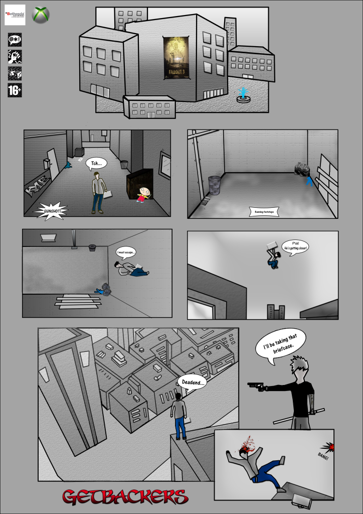
 This is the storyboard I created for my game trailer it starts with a man (main character) tying his shoe then suddenly he hears a gunshot, he looks up panicked and begins to run, he jumps and runs up a wall then starts to hop from building top to building top. In the storyboard I indicate with arrows the direction he is going and wrote comments underneath each image to tell you about what is going on in each scene.
3D Studio Max
Here is all my work that I've created in Studio Max for Unit 64 & 65.
I'm quite happy with most of my models however I believe I could have done better, I made a mistake when creating my house model which made the bricks go all over the place on one side of the wall when I rendered it. I created a circle shape going around the house and attached a camera to it, I then animated the camera to rotate around the house this is how I got the rotated animation:
Bouncing Ball
I created a bouncing ball dropping down a set of stairs to show it hitting an object, I decided to make the ball bounce on a table instead, I quite like my animation as it shows the contact it makes with the table, I implied the technique of "Squash and Stretch" in the animation to give it more effect when the ball is hitting the table and bouncing away. I also created a single ball bouncing up and down on the same spot, it stretches as it drops then squashes as it hits the ground. Some problems I had when creating this animation was getting the ball to squash and stretch at the correct moment, I redid the animation and this is the best I could do with it:
Bone Structure Animation
Next I created and animated a bone structure, we created bones and attached them together using IK and HK solvers. I am happy with my creation because the bones are all functioning proparly (when the bones move the box man moves along with them). I feel I could have done a better animation but as I didn't manage my time correctly, I had to rush to finish it.
Lighting and Cameras
I have added Lighting on my house model by sending lights from above, below and from the sides, it brightens up the house when it is rendered, I have also added a camera making it rotate around so it can capture every side of the house, here are some screenshots of the camera and lighting:
 This image shows the camera and the shape thats attached to it so it may rotate around the house smoothly.

We were given the task of planning and creating a game trailer in 3D Studio Max, however due to certain reasons we never managed to create the trailer, here is the storyboard plan for my trailer and a character sketch for the main character, I am quite happy with my planning as it clearly shows what is happening throughout the story.

This is my main character sketch, it is not finished however I thought I would make him look like a runner by giving him loose clothing, I also added a tattoo down his arm like in Mirrors Edge (free running game) .
 This is the storyboard I created for my game trailer it starts with a man (main character) tying his shoe then suddenly he hears a gunshot, he looks up panicked and begins to run, he jumps and runs up a wall then starts to hop from building top to building top. In the storyboard I indicate with arrows the direction he is going and wrote comments underneath each image to tell you about what is going on in each scene.
3D Studio Max
Here is all my work that I've created in Studio Max for Unit 64 & 65.
I'm quite happy with most of my models however I believe I could have done better, I made a mistake when creating my house model which made the bricks go all over the place on one side of the wall when I rendered it. I created a circle shape going around the house and attached a camera to it, I then animated the camera to rotate around the house this is how I got the rotated animation:
House Model
Bouncing Ball
I created a bouncing ball dropping down a set of stairs to show it hitting an object, I decided to make the ball bounce on a table instead, I quite like my animation as it shows the contact it makes with the table, I implied the technique of "Squash and Stretch" in the animation to give it more effect when the ball is hitting the table and bouncing away. I also created a single ball bouncing up and down on the same spot, it stretches as it drops then squashes as it hits the ground. Some problems I had when creating this animation was getting the ball to squash and stretch at the correct moment, I redid the animation and this is the best I could do with it:
Bone Structure Animation
Next I created and animated a bone structure, we created bones and attached them together using IK and HK solvers. I am happy with my creation because the bones are all functioning proparly (when the bones move the box man moves along with them). I feel I could have done a better animation but as I didn't manage my time correctly, I had to rush to finish it.
Lighting and Cameras
I have added Lighting on my house model by sending lights from above, below and from the sides, it brightens up the house when it is rendered, I have also added a camera making it rotate around so it can capture every side of the house, here are some screenshots of the camera and lighting:
 This image shows the camera and the shape thats attached to it so it may rotate around the house smoothly.
Unit 32 Animation Evaluation
The end product is similar to my original intentions however I am not happy with my final result; I didn’t manage my time correctly and had to rush everything towards the end, because I rushed my animation it turned out very poor and short. The animation is appropriate to my intended audience though I doubt they will enjoy it. If I was to improve my animation I would concentrate on improving the FPS, my current animation has a very poor fps making it obvious they are just images put together and not really creating the illusion of movement. To try and improve my current animation I edited it in Windows movie maker, giving it an old movie sort of effect, this helped its look but not its performance. What I learned from creating my animation is to manage my time better and not rush everything towards the end of the project, I did manage to meet the deadline but not with the quality of animation I intended to hand in, I believe I could have done a lot better. If I were to start over and create it all over again I would manage my time more correctly, not rush when creating the animation so it runs more smoothly and has a better fps rate. I’m happy with the images I gathered for the animation such as the falling man and aeroplane, I’m also happy with the music I put onto the video. After creating my questionnaire and showing my animation to the rest of the class, the feedback I gathered was poor as I expected. Many criticisms I received was the quality of some of the images used and that the fps was pretty bad, they did however find the music to be in good quality. I will take this feedback into consideration when I create my next animation.
Here is my animation:
Tuesday, 23 June 2009
Unit 67 Storyboard
Here is my completed game trailer storyboard, I'm quite happy with my final result as it matches my original intentions. I used many photoshop textures and settings to complete each scene, when drawing my storyboard I used images from the internet to help me create the city scapes and alleyways.
Fonts used:
Sevenswordsmen ( Title )
One Stroke Script ( Speech text )


I first drew the storyboard by hand, then edited the images in photoshop by scanning in the handdrawn version. Here is my hand drawn version storyboard.

Fonts used:
Sevenswordsmen ( Title )
One Stroke Script ( Speech text )
I first drew the storyboard by hand, then edited the images in photoshop by scanning in the handdrawn version. Here is my hand drawn version storyboard.

Tuesday, 16 June 2009
Unit 18 Evaluation
At the start of the project we were given the task of finding and researching different types of icons/symbols, the icons I found and wrote about were, Internet browser icons and Game icons, the symbols that I found and wrote about were, playing card symbols (hearts, diamonds, spades, clover), the Recycling symbol and Tarot card symbols/meanings.
The next project was to identify 5 different themes. Horror, Humour, Sci-Fi, Fantasy and War, with these 5 themes we were asked to create a collage using images we associated with each of them. After the collage work we went back to our Apple research and researched their product the Apple iPhone, I explained all the iPhone’s features and what good and bad points the iPhone has; I also compared it with a different touch screen phone and described the difference in their features.
Then next task was a short one, we researched and explained what the BAF 08 was about and what event were taking place and what we was going to see there. We later went to the BAF 08 in
I then created the 5 final designs in Photoshop, scanning in images I needed or just drawing the icons myself using the toolbar option. The scanning setting that I used was, output resolution: 72 dpi. Here are my 5 final designs I created in Photoshop after tracing a few of them with a drawing pad using the scanned in images.
Horror:

Fantasy:
Humour:

War:

Sci-Fi:

The Icons I created in photoshop were saved as a .gif file format and were placed on an iPhone image. Here is one of my hand drawn icons and its scanning settings:
iPhone Image:

Scanned Icon:

The next task was about ethical considerations, I had to find at least 5 images that seemed offensive and commented why they may have been found offensive, I also explained why my icons that I created were not offensive and what I did not to offend anyone. An example would be my war icon, I could have used many images to make the icon offensive, however I just drew a gun and a piece of land to show no offensiveness.
Subscribe to:
Posts (Atom)